Textile Documents › Topic: Color and pattern design
695 documents found
Sort: 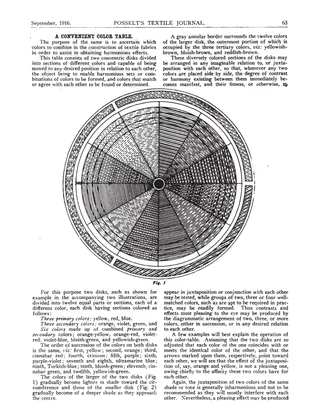
A Convenient Color Table
Article · 2 pages
A short article from Posselt's Textile Journal, September 1916, describing a color table made of two concentric rotating disks divided into twelve colored sections. It explains how to turn the disks to find harmonious combinations of two, three, or more colors for textile fabrics, and how shades of one color can be paired. Two disk diagrams (Figs. 1 and 2) accompany the text.
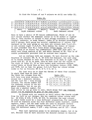
Designing Made Easier - Colour
Master Weaver, March 1957
Article · 5 pages
An article from the Master Weaver bulletin (March 1957) introducing a rule-based method for choosing colour schemes in handweaving. It explains hue, value and chroma using the Munsell notation, and names four colours (A, D, W, Z) by area and contrast. Three tables are used to select hues, values and chromas, and worked examples show how to adjust a scheme when a colour is unavailable in the sample cards. It is the first in a planned series on colour, pattern and texture.
Effects of Colors in Textile Designs
Baldwin's Textile Designer, September 1889
Article · 2 pages
A two-page article from Baldwin's Textile Designer (September 1889) on how colors interact in patterned textile fabrics. It covers primary, binary and tertiary mixed colors, complementary colors, simultaneous contrast, and how juxtaposed colors modify each other's apparent hue. It also notes how thread direction and viewing position change the look of a fabric, with practical advice for designers, dyers, printers and dealers.
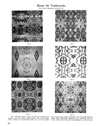
Muster für Textilzwecke [Designs for Textile Purposes]
Article · 2 pages · German
A short German-language article by Romanus Schmehlik on how artists can generate textile patterns by drawing on nature and everyday objects and transforming them with physical-optical aids such as repetition and reflection. It argues that this saves an artist's creative capacity and yields designs for carpets, damask, curtains, embroidery and printing. Six halftone figures show example patterns (bands, lattices, medallions); the author does not describe the methods in detail for lack of space.
Pattern Making by Photography
Textile World Record, November 1913
Article · 2 pages
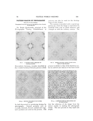
A short 1913 trade-journal article, translated from the German Textile Zeitung, describing Dr. Erwin Quedenfeldt's photographic method for generating textile designs. A camera fitted with a special apparatus reproduces an image in multiple, kaleidoscope-like repeats without mirrors. Source objects include crystals, minerals, agate, marble, butterfly wings and flowers. Eight halftone figures show the resulting patterns, and the text notes that cutting the specimen produces many variations. The article does not cover weaving drafts.
Practical Side of Color Theory Applied to Textile Design
Article · 4 pages
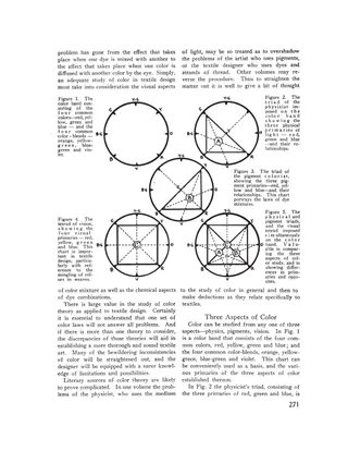
First of three articles by Faber Birren on color theory for textile designers. It argues that woven threads of different colors blend visually in the eye rather than chemically as dyes do, so yellow and blue threads give gray, not green. It compares three color systems (the physicist's light triad, the pigment triad and the visual tetrad) with five diagrams, and uses a black-and-white figure to show how diffusion reduces contrast. It ends with a summary: isolated large areas can use opposing colors for force, while closely woven threads work best in analogous colors.
Some Important Illusions of Color in Textile Design
Article · 3 pages
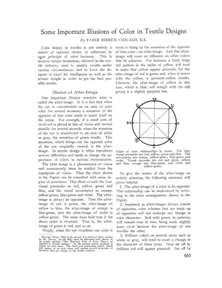
An article by Faber Birren, the second of three on color in textile design, explaining optical illusions that affect how colors look in woven and printed fabrics. It covers the after-image (the opposite color the eye generates), how it shifts adjacent colors, and fixes such as adjusting dye tones or outlining color areas. It also discusses advancing and retreating colors, the effect of dull backgrounds on pure colors, and the diffusion of analogous colors in woven threads, including changeable silks, to gain brilliance or achieve harmony.
Subjective Colours
Master Weaver, January 1959
Article · 3 pages
A short essay from the Master Weaver bulletin on the psychology and symbolism of single colours, independent of color theory or contrast. It discusses the emotional and cultural associations of yellow, red, blue, green, purple, white and black, and suggests suitable colours for baby blankets and for clothing and interiors. It ends with advice to weavers to consider the psychological value of each colour, especially dominants and accents, when planning a project.
"What Pattern Is" in Pattern Design
Monograph · 11 pages
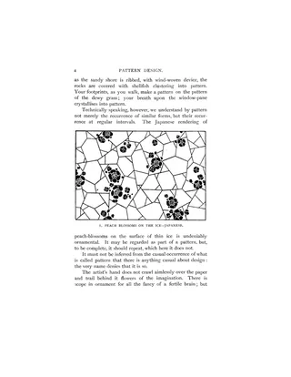
The opening chapter of Lewis F. Day's 'Pattern Design' (1903), a student's guide to the planning and evolution of repeated ornament. It argues that pattern results from repetition, is tied to manufacture, and always rests on a geometric basis, so a designer must plan the lines of a repeat deliberately and not leave them to chance. Four illustrations include a Japanese peach-blossom-on-ice design, a pattern with planned gaps, a heraldic panel and a balanced scroll wall pattern.
From the Classics - Harmonious Colouring
Article · 1 page
A one-page "From the Classics" excerpt reprinted in Master Weaver, quoting passages on harmonious colour arrangement from Clinton G. Gilroy's 1844 book The Art of Weaving. It compares the science of colour to musical harmony, describing three primary colours, secondary colours, seven distinct colours matching the musical scale, and the idea of a key colour or tone governing an arrangement. The page also begins with the end of an unrelated passage on cutting pile fabric.
Light for the Colorist, addendum
Article · 1 page
A short addendum by E. Leavenworth Elliott to his October 1931 article on lighting for colorists. He clarifies that although blue glass is easy to make, producing glass of an exact shade and density that raises an electric lamp's color temperature without color distortion requires combining two or three coloring agents, with a high rejection rate and therefore higher prices. He warns colorists against so-called daylight lamps that use cobalt blue glass of insufficient density.
Light for the Colorist, Part 1
Article · 6 pages
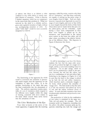
An article from The Melliand introducing the physics of light and color for technical colorists and artists, as the start of a series on lighting for the colorist. It draws analogies between sound and light (pitch/color, loudness/brightness, timbre/wave form), describes the three-resonator theory of color vision in the retina, and explains how spectrophotometers analyze color by wave length and brightness. It closes with color temperature, comparing noon sunlight (about 5000°C) with the Mazda C tungsten lamp and sky conditions, and the need for a standard light for color work.
Light for the Colorist, Part 2
Article · 2 pages
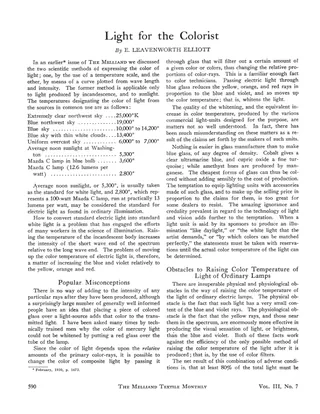
An article on artificial and natural light as it affects color matching and color work in the textile industry. It reviews color temperature scales for common light sources, the standard of 5,300°K noon sunlight for white light and 2,800°K for ordinary electric light, and why blue glass filters can whiten electric light only by absorbing at least 80% of it. It warns against exaggerated claims by makers of 'daylight' lamps, explains the difference between lenses and curved glass placques, and discusses the differing lighting needs of the technical colorist and the artist.
Motives for Borders and Stripes
Article · 1 page
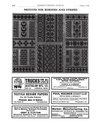
A single page from Posselt's Textile Journal showing a sheet of decorative design motifs for borders and stripes, with repeating circles, diamonds, geometric blocks and floral-like forms in black and white. The rest of the page is taken up by advertisements from Philadelphia-area textile supply and service firms.
Motives for Borders and Stripes
Article · 1 page
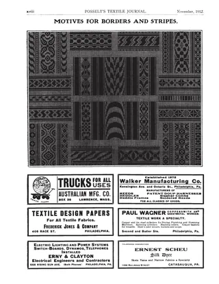
A single journal page from Posselt's Textile Journal titled "Motives for Borders and Stripes," consisting of a large plate of decorative woven-pattern motifs with geometric and floral border and stripe designs. The rest of the page is occupied by advertisements from Philadelphia-area textile suppliers and service businesses.
Motives for Borders and Stripes
Article · 1 page
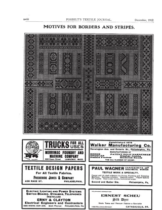
A single page from Posselt's Textile Journal showing a large halftone plate of motives for textile borders and stripes, with geometric diamond and lattice patterns and repeating border bands. The rest of the page is taken up by advertisements from Philadelphia-area textile suppliers and machinery makers. There is no explanatory text or weaving draft.
Varioskop Musterung [Varioskop Patterning]
Article · 2 pages · German
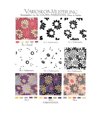
A two-page illustrated item on the Varioskop pattern system published by the Colorix-Werkstätten in Zittau, Saxony. Page 1 shows an original floral pattern, five separated color-form parts (a–e), and variations produced from them. Page 2 shows a projection dianegative and the projected image without filters. Text is limited to figure captions.
What Particular Advantages Does Ostwald's Color Theory Offer?
Article · 3 pages
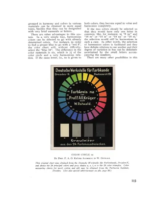
A 1929 trade article by F. A. O. Krueger explaining how Wilhelm Ostwald's color system lets a color be specified by a number and letters, so it can be telegraphed and reproduced with a step photometer. It describes the Ostwald color measurement triangles and color circle from the Deutsche Werkstelle für Farbkunde in Dresden, and the pocket-sized reference charts and cloth-sample versions on silk, wool and cotton. It argues that the system standardizes dye shades, reduces dyestuff stock, simplifies color selection in mills and stores, and makes harmonious combinations easy to find. Includes a reproduced color circle chart.
Woven Fabric, US Patent No. D0034119
Patent · 2 pages
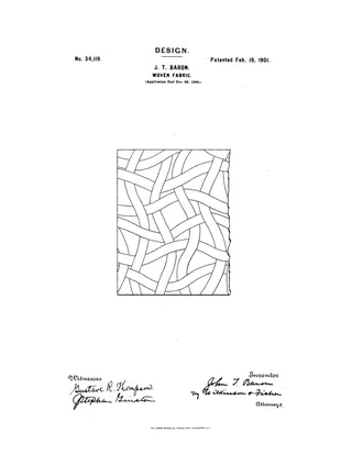
US design patent No. 34,119, granted February 19, 1901 to John Thomas Baron of Providence, Rhode Island, assignor to Farnsworth, Hoyt & Company of Boston. It covers an ornamental design for a woven fabric, intended especially for a duck used to lining shoes and other articles subject to hard wear. The design shows interwoven curved tapes or ribbons that intersect at irregular angles, with square intersections at intervals. The patent has a drawing page and a one-page specification with a single claim.
The Adaptation of Light for Color Workers
Article · 5 pages
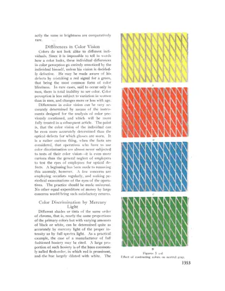
A 1929 article from The Melliand on how lighting affects color perception and discrimination in textile factories. It covers the effect of illumination intensity on different hues, eye fatigue and reflex action, variation in daylight, individual differences in color vision, and the use of mercury, incandescent, and mixed lighting for color matching. Examples are drawn from hosiery, woolen and worsted weaving, carpets, and patterned knitting.
Art of Weaving
Article · 1 page
A single page from Master Weaver, No. 22, July 1955. It opens with the end of an editorial on creativity in weaving design, which warns against relying on mathematical formulas, music or words transcribed into drafts as a source of artistic pattern. It closes with a short "From the Classics" excerpt from Clinton G. Gilroy's 1844 book on the art of weaving, which comments on the skill of American weavers and the progress of the textile arts.
Avoidance of Color Troubles Caused by Electric Light, Part 1
Article · 6 pages
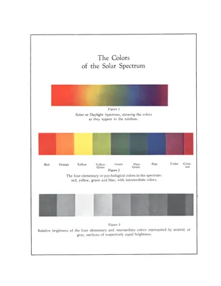
Part 1 of an article on avoiding color problems under electric light in industry, concentrating on the fundamentals of color theory. It argues that color vision matters for only a small share of workers, chiefly in textiles, and then explains color as a mental sensation, a property of light and a property of surfaces. Topics include elementary colors, chroma, brightness, saturation, tints, shades, hues, wave lengths, reflection, fluorescence, and the difference between mixing pigments and mixing lights. Three spectrum figures are included, and the article is continued in a later part.
Block Substitution, Part 1: Basic Concepts
Ralph E. Griswold · July 17, 2002
Web Doc · 3 pages
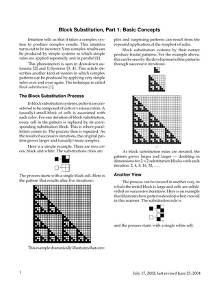
A short introductory article by Ralph Griswold explaining block substitution, a system in which each cell of a pattern is repeatedly replaced in parallel by a small block of cells, producing complex fractal patterns from simple rules. It works through a 2x2 black/white example and a subdivision view that yields the Morse-Thue carpet, noting its use as a non-repeating weave. It also notes the limits on the number of 2x2 rule systems and points to larger blocks and more colors in later parts.
Block Substitution, Part 2: Initial Patterns.Substitution Blocks. and Color
Ralph E. Griswold · December 7, 2002
Web Doc · 4 pages
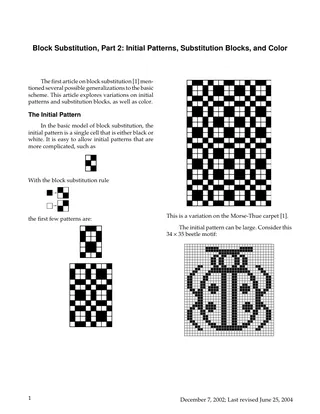
Second article in Ralph Griswold's series on block substitution, a method of generating cellular patterns by repeatedly replacing each black or white cell with a small block of cells. It covers more complex and large initial patterns (including a 34 x 35 beetle motif), substitution blocks of non-square dimensions, rules with special effects such as color reversal, magnification and line extension, and the use of more than two colors. Illustrated with black-and-white and color pattern examples; no weaving drafts are included.
Colour and Design
Master Weaver, July 1955
Article · 6 pages
An essay from the Master Weaver newsletter (Fulford, Quebec) on what creativity means in handweaving. It argues that weavers cannot compete with industry on technical innovation and should focus on colour, texture and pattern, and that a good designer must know the materials and techniques of weaving. It discusses folk-art traditions, the limits of formulas for colour and design (Leonardo, Van Gogh, Oswald), and 'accidentalism' such as turning words or music into drafts. A short 1844 quotation from Clinton G. Gilroy closes the piece, and the author promises practical examples in the next issue.
Design and the Handweaver Portfolio
Other · 3 pages
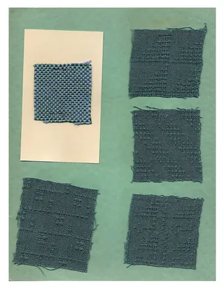
Cover and sample pages from the Portfolio Edition of Mary Meigs Atwater's Shuttle Craft Monograph Three, 'Design and the Handweaver' (1961). The scan has a title page and two pages of mounted handwoven fabric samples in assorted colors and textures. It has no running text or weaving drafts.
Fabric, US Patent No. D0036210
Patent · 2 pages
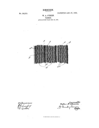
US design patent No. 36,210, granted January 27, 1903 to Walter A. O'Brien of Boston, assignor to Sterling Knit Goods Company, for an ornamental fabric design. The design shows broad bands of small sinuous ribs, edged by large rope-like wales and separated by trough-like depressions. The document has a drawing sheet and a one-page specification with a single claim, and it contains no weaving drafts.
Handweaving News (June 1933): Notes on Color
Periodical · 3 pages
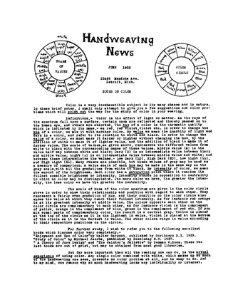
A June 1933 issue of Nellie Sargent Johnson's Handweaving News, written as a letter to handweavers about using color. It defines hue, value, intensity, the color circle and complementary colors, lists books for further study, and suggests practice exercises with colored paper, crayons and paints. Eight weaving color problems follow (equalization, sequences, triads, contrasting complements, laid-in designs, bright tabby, harmonizing inharmonious colors, and analysis of colors in nature). No threading drafts are included.
Motives for Borders and Stripes
Article · 1 page
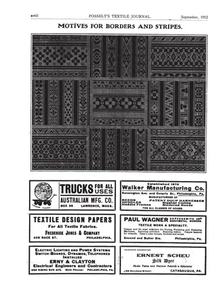
A single journal page showing a large plate of black-and-white design motifs for textile borders and stripes, with geometric and floral repeats arranged in panels. The page carries no text discussion of the designs. The rest of the page is advertising from Philadelphia-area textile suppliers.
The Origination of New Designs
Article · 3 pages
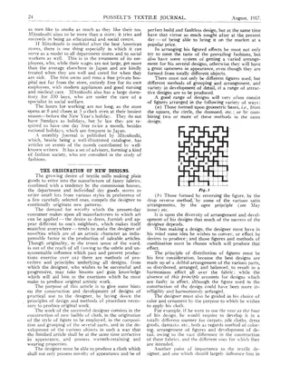
An article from Posselt's Textile Journal (August 1917) on the principles of originating new textile designs. It covers the designer's need for variety in figure arrangement, the influence of yarn and fabric type on design, and the use of the square and other geometric bases as frameworks for repeating patterns. Five figures show square-based designs, including a key pattern, a floral design built from circles, and a damask tablecloth border. The scan ends with a short unrelated item on England's raw cotton situation.
Significant Principles of Color Harmony That Are Unique in Textile Design
Article · 4 pages
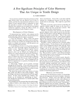
Faber Birren's article for The Melliand Textile Monthly sets out principles of color harmony for textile designers. It describes how color dimension, diffusion, opposites and after-image outlines can be used to plan color schemes. It then divides harmony into analogies (of tone, of colors, of a dominant color) and attraction (contrast of brightness, purity and colors), illustrated with a circular color chart showing eight hues of equal gray tone. The scan also includes a page from an unrelated technical article describing the eriometer, a diffraction instrument for measuring wool fiber diameter.
Suggestions for Design Based on Mohammedan or Saracenic Art
Article · 2 pages
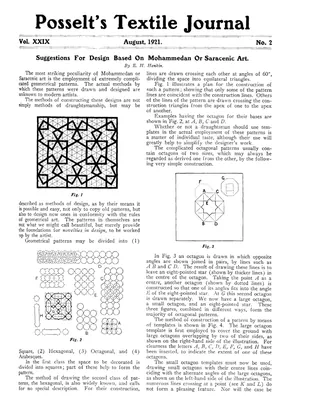
Part of a serial article by E. H. Hankin on constructing geometrical patterns in Mohammedan (Saracenic) art, covering square, hexagonal, octagonal and arabesque classes. It explains construction grids, the large octagon, small octagon and eight-pointed star, and the use of templates to build octagonal patterns, illustrated with line-drawn figures. The scan also includes the start of a report on the Second World Cotton Conference held in Liverpool and Manchester in June 1921.
Unusual Color Schemes
Article · 2 pages
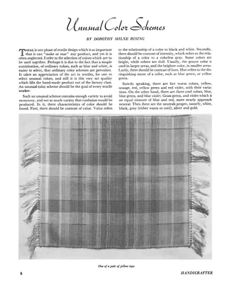
A short article on choosing unusual color schemes for handwoven textiles, covering contrast of value, intensity and hue, and the balance of warm, cool and neutral colors. The author analyzes a woven runner and a pair of pillow tops made for her mother's living room, listing the warp colors and the long weft color sequences used. The article stresses color rather than design or thread counts, and includes photographs of the runner and one pillow top.
The Weaver's Palette
Article · 4 pages
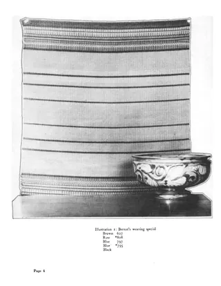
A 1939 magazine article by Natalie T. Corbett urging handweavers to use color more boldly. It offers four suggestions: base table pieces on a specific piece of pottery, match bags to the season's fashion colors, take color cues from fabric swatches, and weave luncheon sets for particular dishes. Illustrated with table pieces woven on a Rose Path threading in Bernat wools, with yarn color numbers listed for each; no drafts or treadlings are given.
American YarnsAn Inspiration for Weavers
Article · 7 pages
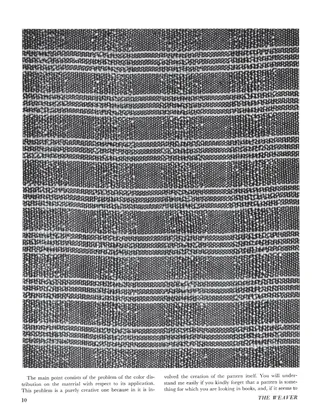
Part Two of Maria Steinhoff's essay in the first issue of The Weaver, discussing creative inspiration in weaving. She argues that yarn texture and color, not copied pattern-book drafts, should drive design, and she applies this to dress fabrics suited to the wearer's figure, coloring and personal versus collective taste, and to designing handwoven cloth that will sell. It closes with captions for five illustrations of her fabrics, giving the Bernat yarns used for warp and filler.
Avoidance of Color Troubles Caused by Electric Light, Part 2
Article · 7 pages
Second part of a series on how electric lighting distorts color in textile work. It covers the physiological basis of color vision, a classification of hues (warm, cold, browns, grays), and how incandescent and mercury light change the appearance of surfaces compared with daylight, with a figure comparing spectra. It then distinguishes colorists (designers, dyers) from workmen who only need to avoid mistaking colors, and recommends educating workers, using numbers or symbols for identification, and choosing distinguishable color series for fugitive silk dyeing under different lights.
Composing and Combining Weaves
Baldwin's Textile Designer, September 1888
Article · 1 page · weaving drafts
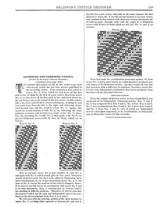
A single-page installment from Baldwin's Textile Designer (continued from page 106) on building complex weaves by combining simpler ones. It explains how to take picks (bars of chain) alternately from weaves No. 3 and 5, and No. 3 and 6, to produce 16-harness weaves No. 7 and No. 8 with 32 bars of chain. It then combines the harnesses of Nos. 7 and 8 to make the 32-harness weave No. 9, and closes with a recapitulation of how all the weaves derive from one another. Three drawdown grids illustrate Nos. 7, 8 and 9, which the author recommends for fine worsteds.
The Modern Approach to Weaving
Article · 2 pages
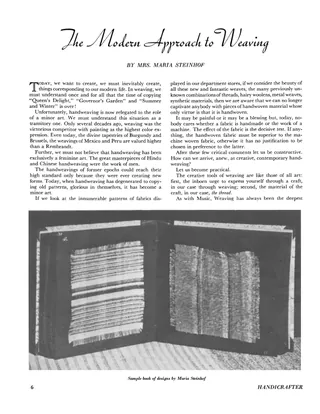
An essay by Maria Steinhof urging handweavers to stop copying traditional patterns such as Queen's Delight, Governor's Garden and Summer and Winter, and to create contemporary designs through direct experimentation with thread. She argues that handweaving must be judged by the effect of the fabric, not by being handmade, and predicts that handloom patterns will influence industrial textile production. The two pages are illustrated with a sample book of designs and photographs of handwoven napkin fabric and handbags made with Bernat yarns.
Modern Weaving
Master Weaver, May 1954
Article · 3 pages
Issue No. 15 (May 1954) of Master Weaver, published by Z-Handicrafts in Fulford, Quebec. It opens with an editorial essay on what "modern" and "contemporary" mean in weaving, arguing that modern work should be better, not merely different, and warning against copying other modern weavings. The "From the Classics" section reprints Alexander Peddie's 1822 (Glasgow) instructions for boiling and cleansing linen yarn with pot ash and pearl ash, with a modern note on the proportions.
Nonlinear Grid Design, Part 1: Introduction
Ralph E. Griswold · October 30, 2004
Web Doc · 14 pages
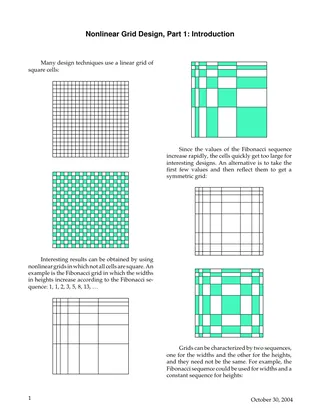
A short introductory article by Ralph Griswold on designing with nonlinear grids, in which cell widths and heights follow number sequences rather than being uniform squares. It explains Fibonacci grids, reflected symmetric grids, scaling factor and resolution, and defines five sequences (constant, integer, multi-integer, Fibonacci, prime). The remaining pages are grid plots for combinations of these sequences (C x I, C x M, I x F, P x P, etc.), serving as templates for design work.
Suggestions for Design Based on Mohammedan or Saracenic Art
Article · 3 pages
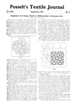
A continuation (from the August issue) of a series on designing patterns based on Mohammedan or Saracenic art, covering complex arabesque patterns. It explains how to construct them from primary construction lines (polygons in contact such as octagons, decagons, pentagons, heptagons and sixteen-sided polygons) and secondary construction lines (circles and radii), with worked examples in Figs. 8-13. It closes with remarks on accuracy, symmetry and avoiding monotony in geometric ornament. The scan ends with the opening of an unrelated article on sizing cotton yarns.
Treatise on the Art of Weaving - Taste
Article · 1 page
A single page from Master Weaver, No. 13, January 1954. It opens with the end of an article on drawing down drafts for two-harness looms, with pattern frames and ground frames. Below that is a "From the Classics" excerpt from John Murphy's Treatise on the Art of Weaving, on taste in fancy weaving, quoting Dr. Blair's remarks on taste from his lectures on Rhetoric and the Belles Lettres.
Triaxial Weaving Templates
Ralph E. Griswold · December 14, 2001
Web Doc · 9 pages
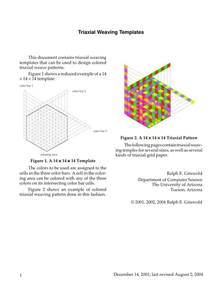
A short web document by Ralph E. Griswold offering printable templates for designing colored triaxial weave patterns. The first page explains how to use a template: colors are assigned to three color bars, and each cell in the coloring area takes one of the three colors on its intersecting bar cells. It includes an example 14 × 14 × 14 template and a colored pattern. Blank 10 × 10 × 10, 12 × 12 × 12 and 14 × 14 × 14 templates follow, then several pages of triaxial grid paper.
Adaptations of Commercial Weaves
Article · 2 pages · weaving drafts
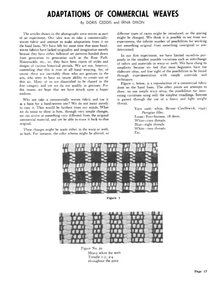
A short article describing an experiment in adapting a commercially woven checked fabric on a four-harness hand loom. The authors argue that hand weavers can create original work by making simple changes in color, yarn type, and spacing rather than copying traditional patterns. They give the warp setup (white and blue stripes, 18 dents) and weft and treadling variations for a series of sample swatches, including plain-weave stripes and twill.
Colour and Wool
Article · 4 pages
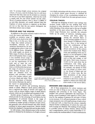
A short illustrated article by D. R. Christie on colour theory as applied to wool textiles. It explains primary, secondary, tertiary and complementary colours, then covers colour mixing in loose wool, self-colour yarns, Scottish tartans and district checks, colour twists, and colour contrasts in woven fabrics. Photographs show a yarn dyer checking shades and slubbing dyeing in large vats, and a collage shows wool blends, a Ferguson tartan and suiting samples.
Designing
Textile Mercury, March 15, 1890
Article · 2 pages · weaving drafts
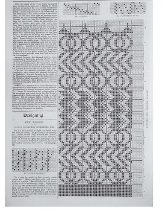
Two-page installment of a series on textile design from The Textile Mercury, 15 March 1890. It gives new cotton plush designs for coverlets and bed spreads with pegging plans and drafts, and describes a Loongee and Dhootie border design from Rajahmundry, Madras, including its colors and silk and gold thread ornament. It then explains how to arrange figures in a repeat square, with Diagram A and Figures 10 and 11, and gives Design 56 as a way to work out Figure 10 using warp- and weft-flush effects.
Designing
Textile Mercury, 1892
Article · 1 page · weaving drafts
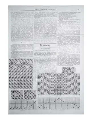
A short 1892 Textile Mercury piece on new fancy shirting and spring dress fabric designs, with colour combination suggestions and fashion notes on silks, plush and checks. It gives cotton warp and weft particulars for Design A (shirtings, dress materials, aprons) and Design B (fancy shirting), with pegging plans and drafts shown as grid diagrams. The scan also includes a column of unrelated textile trade news items.
Designing
Textile Mercury, January 30, 1892
Article · 1 page · weaving drafts
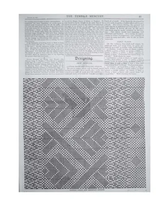
A single page from The Textile Mercury, 30 January 1892, with a "New Designs" feature. It gives a cotton dress and shirting design shown as a large drawdown grid of block-patterned checks, with notes on warp and weft counts, ends and picks per inch, and colour suggestions. It also gives three fancy plaid colour sequences on a four-shaft twill weave, with thread counts and finishing details. The top of the page carries unrelated trade news on Indian mill wages and a Judge Hughes lecture on work and wages.
Designing
Textile Mercury, 1890
Article · 2 pages · weaving drafts
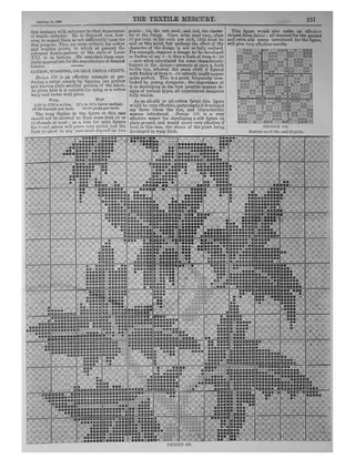
Two pages from The Textile Mercury of 11 October 1890. The first page is mostly dyeing and chemistry notes (printing blue on Congo red, effect of wool oiling on dyeing, a new yellow dye, indigo valuation) followed by the start of a 'Designing' section on using microscopic organisms as motives for textile decoration. The second page continues with Professor Schricker's designs and a note on Design 188, a cotton, worsted or silk dress stripe with warp and weft specifications and sateen flush advice, plus drawdown grids for Designs 188 and 189.
Designing Made Easier - Numerical Patterns
Master Weaver, September 1957
Article · 4 pages
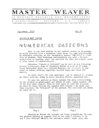
Final article in the Master Weaver series on designing, describing a method of generating patterns from numerical formulas. A graph-paper grid is filled with colours in a chosen path (the 'movement') using fixed colour proportions such as 6, 3, 4 for dominant, accent and subdominant. Figures compare circular, horizontal and S-shaped movements and different colour ratios. The author notes the method suits free weaves needing many harness frames (chenille rugs, swivel, inlay, pick-up, tapestry, knotted rugs) and discusses whether formula-made designs have any value. The issue page ends with a short 'From the Classics' quotation by C.C. Gilroy (1844) on the pattern drawer's need for imagination and knowledge of geometry.
695 documents found