Some Important Illusions of Color in Textile Design
Sample pages
Page 1, at reduced quality. Open the document to read every page in full.
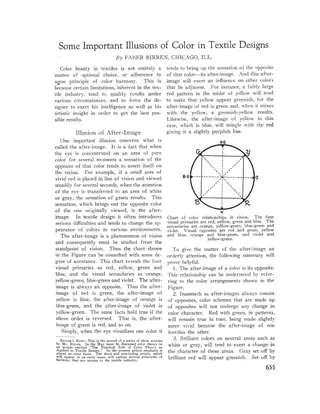
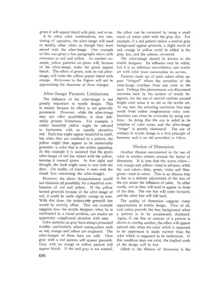
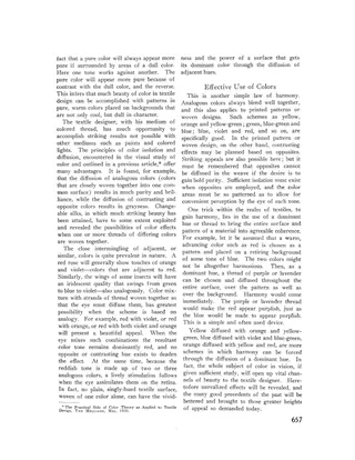
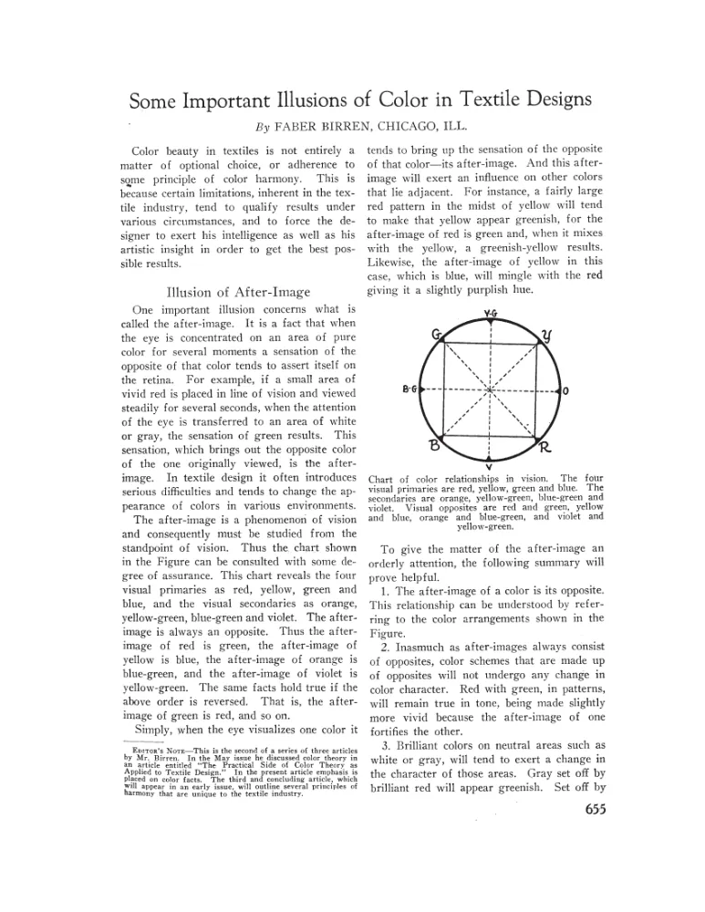
An article by Faber Birren, the second of three on color in textile design, explaining optical illusions that affect how colors look in woven and printed fabrics. It covers the after-image (the opposite color the eye generates), how it shifts adjacent colors, and fixes such as adjusting dye tones or outlining color areas. It also discusses advancing and retreating colors, the effect of dull backgrounds on pure colors, and the diffusion of analogous colors in woven threads, including changeable silks, to gain brilliance or achieve harmony.
- Type
- Article
- Date
- August 1930
- Language
- English
- Pages
- 3
(A free account is all you need)
From Ralph Griswold's Digital Archive, delivered by the University of Arizona.
Have missing pages or a better copy of this document, or another document to share? Contributing documents »