Unusual Color Schemes
Sample pages
Page 1, at reduced quality. Open the document to read every page in full.
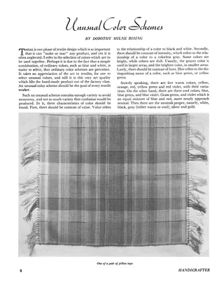
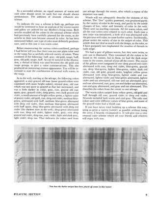
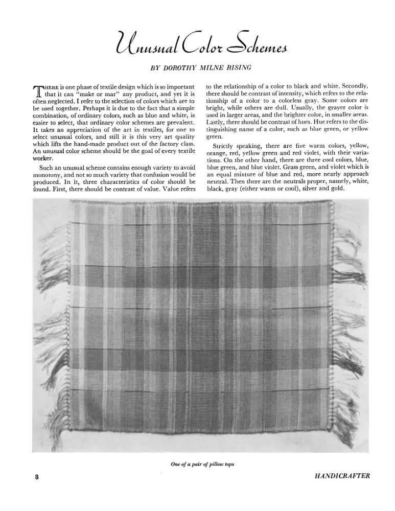
A short article on choosing unusual color schemes for handwoven textiles, covering contrast of value, intensity and hue, and the balance of warm, cool and neutral colors. The author analyzes a woven runner and a pair of pillow tops made for her mother's living room, listing the warp colors and the long weft color sequences used. The article stresses color rather than design or thread counts, and includes photographs of the runner and one pillow top.
- Type
- Article
- Date
- c. 1934
- Language
- English
- Pages
- 2
(A free account is all you need)
From Ralph Griswold's Digital Archive, delivered by the University of Arizona.
Have missing pages or a better copy of this document, or another document to share? Contributing documents »