Significant Principles of Color Harmony That Are Unique in Textile Design
Sample pages
Page 1, at reduced quality. Open the document to read every page in full.
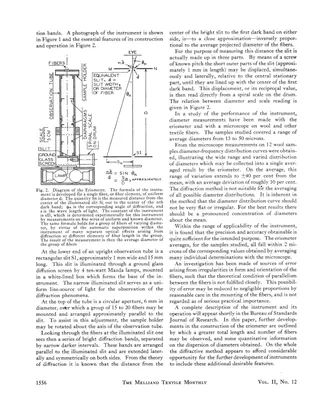
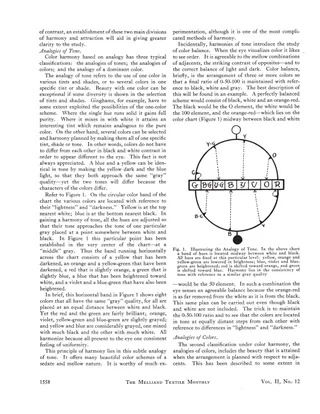
Faber Birren's article for The Melliand Textile Monthly sets out principles of color harmony for textile designers. It describes how color dimension, diffusion, opposites and after-image outlines can be used to plan color schemes. It then divides harmony into analogies (of tone, of colors, of a dominant color) and attraction (contrast of brightness, purity and colors), illustrated with a circular color chart showing eight hues of equal gray tone. The scan also includes a page from an unrelated technical article describing the eriometer, a diffraction instrument for measuring wool fiber diameter.
- Type
- Article
- Date
- March 1931
- Language
- English
- Pages
- 4
(A free account is all you need)
From Ralph Griswold's Digital Archive, delivered by the University of Arizona.
Have missing pages or a better copy of this document, or another document to share? Contributing documents »